Mega Menu
ProInstallation
npx shadcn add @useplanes/mega-menu
Works once the @useplanes registry is set up in your project (one-time). After that, copy and run commands directly.
Unlock with Planes Pro
$99 once · 161 Pro components · lifetime updates.
import { MegaMenu } from "@/components/ui/MegaMenu";

<MegaMenu
  items={[
    { id: "product", label: "Product", width: 520, content: <ProductPanel /> },
    { id: "resources", label: "Resources", width: 380, content: <ResourcesPanel /> },
  ]}
/>
Examples
Measured morph
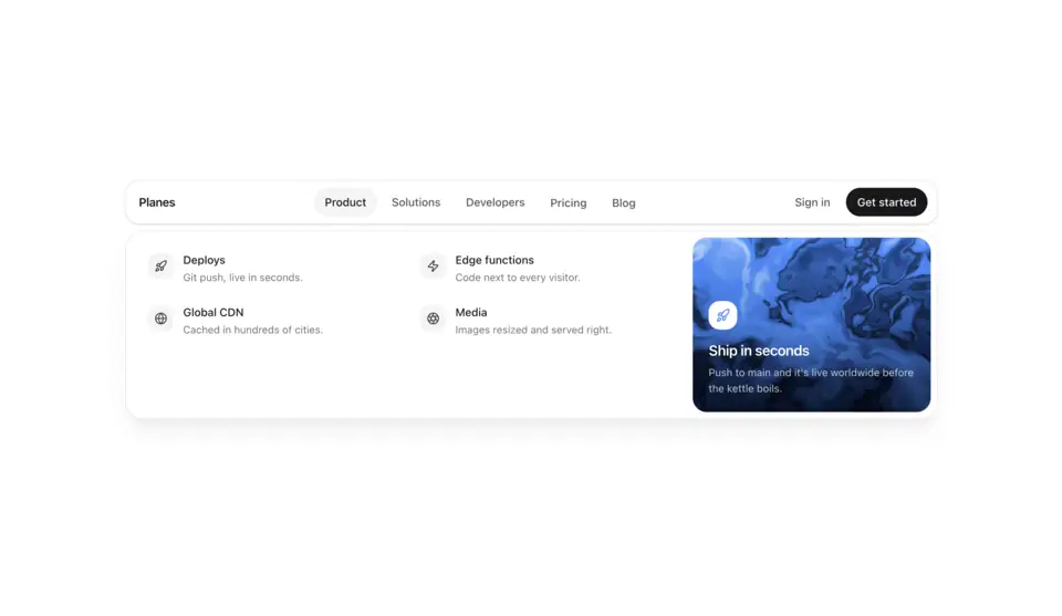
The panel is absolutely positioned, so animating its width and height only relayouts the panel itself, never the page. Content crossfades with a direction-aware slide; the caret tracks the trigger with a spring.
<MegaMenu items={items} align="start" />Keyboard
Focus a trigger to open, Enter or ArrowDown to move into the panel, Escape to close. Reduced motion makes every step instant.
<MegaMenu items={items} />Use cases
Multi-product navigation
Vercel-style menu where each item has a differently sized panel.
Docs + resources
Grouped link lists that reshape rather than swap.
E-commerce categories
Wide grids for departments, narrow lists for help.
Marketing site header
Pairs with ShrinkingNav.